

>> This is a little bit advanced topic, In this lecture we will learn about plotting in MATLAB. It is very easy. For plotting we just use simple plot function 'plot(x,y)'. Where x the range of values for which the function is to be plotted and y is the function. Example:
x = [0:0.1:52];
y = 0.4*sqrt(1.8*x);
plot(x,y)
When you hit enter a new window is pop up which shows the graph as shown in pic below. Click the image.

See very simple.
Nomenclature for a typical xy plot:
MATLAB allows you to add tittle, labels along the x-axis and y-axis etc to make your graph more descriptive. Some commands is shown in figure.

Grid Command:
The grid command displays grid lines (like mesh) at the tick marks corresponding to the tick labels. Type grid on to add grid lines. Type grid off to stop plotting grid lines.
Axis Command:
You can use the axis command to override the MATLAB selections for the axis limits. The basic syntax is axis( [ xmin xmax ymin ymax]). you can set x-axis and y-axis range from this command. This command sets the scaling for the x- and y-axes to the minimum and maximum values indicated. Note that, unlike an array, this command does not use commas to separate the values.
Title and label commands:
The title command allows you to put a title on the graph. And xlabel and ylabel commands generate labels along x-axis and y-axis.
Example:
click image to see example

Subplot command:
Subplot command is used to obtain several smaller “subplots” in the same figure. The syntax is subplot(m,n,p). Here m is number of rows, n is number of columns and p is the number which tell where to put graph. This command divides the Figure window into an array of rectangular panes with m rows and n columns. For example, subplot(3,2,5) creates an array of six panes, three panes deep and two panes across, and directs the next plot to appear in the fifth pane (in the bottom-left corner).
Example:
Here subplot(1,2,1) means it generate an array of first row and second column and placed x and y graph to first row and first column. Now for subplot(1,2,2) means it generate an array of first row and second column and placed x and z graph to first row and second column. Click the image to view.
Note: In this example the command abs() is used. Its purpose is to take the absolute value

Plotting Polynomials with the polyval Function:
polyval is the built in command for graphing the polynomial function.
Example:

Data Markers and Line Types:
To plot y versus x with a solid line and u versus v with a dashed line, type plot(x,y,u,v,’--’), where the symbols ’--’ represent a dashed line.
To plot y versus x with asterisks (*) connected with a dotted line, you must plot the data twice by typing plot(x,y,’*’,x,y,’:’).
To plot y versus x with green asterisks (*) connected with a red dashed line, you must plot the data twice by typing plot(x,y,’g*’,x,y,’r--’).
Specifiers for data markers, line types, and colors:
Some of data marker, line types and colors shown in figure below. Click to see.

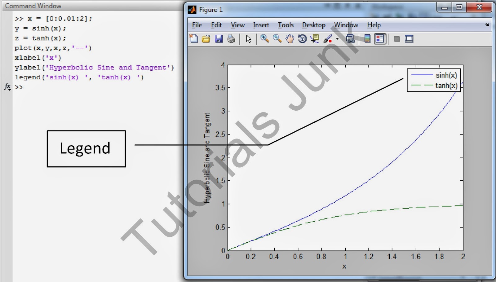
Labeling Curves and Data:
When more than one curve or data set is plotted on a graph, we must distinguish between them. If we use different data symbols or line types, then we must either provide a legend. To create a legend, use legend command. The basic form of this legend is
>> legend(‘string1’, ‘string2’)
% string1 and string2 are text strings of your choice.
The legend command automatically obtains from the plot the line type used for each data set and displays a sample of this line type in the legend box next to the string you selected.
Example:
A example is shown in figure below click to see.
Plot the Complex Numbers:
With only one argument, say plot(y) the plot function will plot the values in the vector y versus their indices 1,2,3...... and so on. If y is complex plot(y) plots the imaginary parts versus the real parts. Thus plot yin this case is equivalent to plot(real(y), imag(y)).
This situation is the only time when the plot function handles the imaginary parts in all other variants of the plot function, it ignore the imaginary parts.
Example:
Click to see image.

plot and fplot command:
MATLAB has a smart command for plotting functions. fplot analyzes the function to be plotted and decides how many plotting points to use so that the plot will show all the features of the function.
Syntax:
>> fplot (‘string’, [xmin xmax])
>> fplot (‘string’, [xmin xmax ymin ymax])
Example:
In this example we use this function cos(tan(x))-tan(sin(x)) to plot by using fplot and plot command.
With Plot:
x=[0:0.1:10];
f = cos(tan(x))-tan(sin(x))
plot(x,f)

With fplot:
x=[0:0.1:10];
f = 'cos(tan(x))-tan(sin(x))'
fplot(f, [1 2])

Hold and figure command:
Hold command is used to create plot that needs two or more plots. Means we want to plot 2 or more graphs in the same window
Example:
x= [0:0.1:10];
y1=sin(x);
y2=cos(x);
plot(x,y1,'go')
hold
plot(x,y2,'r*', x,y2, ':')
legend('Sin(x)', 'Cos(x)')

Figure command is used to draw 2 or more graphs on different window as shown in example below.
Example:
x= [0:0.1:10];
y1=sin(x);
y2=cos(x);
figure
plot(x,y1,'go')
legend('Sin(x)')
hold on
figure
plot(x,y2,'r*', x,y2, ':')
legend('Cos(x)')

text and gtext command:
Text command is used to place the string text in the figure window at a point specified by coordinates x,y.
Syntax:
>> text(x,y,’text’)
Gtext command is used to place the string text in the Figure window at a point specified by the mouse. When you click the mouse on the window the text will appear there.
Syntax:
>> gtext(‘text’)
Example:
>> x= [0:0.1:10];
y1=cos(x);
y2=sin(x);
plot(x,y1,'go')
hold
plot(x,y2,'r*', x,y2, ':')
legend('cos(x)', 'sin(x)')
text(5,0,'plot of cos and sine')
gtext('This is the text to be
pasted by mouse')

Logarithmic Plots:
Why use log scales?
Rectilinear scales cannot properly display variations over wide ranges.

A log-log plot can display wide variations in data values.

It is important to remember the following points when using log scales:
1. You cannot plot negative numbers on a log scale, because the logarithm of a negative number is not defined as a real number.
2. You cannot plot the number 0 on a log scale, because log10 0 = ln 0 = -infinity. You must choose an appropriately small number as the lower limit on the plot.
3. The tick-mark labels on a log scale are the actual values being plotted, they are not the logarithms of the numbers. For example, the range of x values in the plot in previous figure is from 10-1 = 0.1 to 102 = 100.
Syntax:
MATLAB has three commands for generating plots having log scales. The appropriate command depends on which axis must have a log scale.
1.Use the loglog(x,y) command to have both scales logarithmic.
2. Use the semilogx(x,y) command to have the x scale logarithmic and the y scale rectilinear.
3. Use the semilogy(x,y) command to have the y scale logarithmic and the x scale rectilinear.
Example:
x=0:0.5:50;
y=5*x.^2;
subplot(2,2,1), plot(x,y)
title('Polynomial - linear/linear')
ylabel('y'),grid
subplot(2,2,2), semilogx(x,y)
title('Polynomial - log/linear')
ylabel('y'),grid
subplot(2,2,3), semilogy(x,y)
title('Polynomial - linear/log')
ylabel('y'),grid
subplot(2,2,4), loglog(x,y)
title('Polynomial - log/log')
ylabel('y'),grid

Saving Figures in Matlab:
To save a figure that can be opened in subsequent MATLAB sessions, save it in a figure file with the .fig file name extension. To do this, select Save from the Figure window File menu or click the Save button (the disk icon) on the toolbar. If this is the first time you are saving the file, the Save As dialog box appears. Make sure that the type is MATLAB Figure (*.fig). Specify the name you want assigned to the figure file. Click OK.
Requirements for a Correct Plot:
The following list describes the essential features of any plot:
1. Each axis must be labeled with the name of the quantity being plotted and its units! If two or more quantities having different units are plotted (such as when plotting both speed and distance versus time), indicate the units in the axis label if there is room, or in the legend or labels for each curve.
2. Each axis should have regularly spaced tick marks at convenient intervals—not too sparse, but not too dense—with a spacing that is easy to interpret and interpolate. For example, use 0.1, 0.2, and so on, rather than 0.13, 0.26, and so on.
3. If you are plotting more than one curve or data set, label each on its plot or use a legend to distinguish them.
4. If you are preparing multiple plots of a similar type or if the axes’ labels cannot convey enough information, use a title.
5. If you are plotting measured data, plot each data point with a symbol such as a circle, square, or cross (use the same symbol for every point in the same data set). If there are many data points, plot them using the dot symbol.
6. Sometimes data symbols are connected by lines to help the viewer visualize the data.


0Awesome Comments!